I’m afraid this summer has gotten by without me catching very many images. We’ve been busy building a new house and time is flying by. I hope you enjoy these.


I’m afraid this summer has gotten by without me catching very many images. We’ve been busy building a new house and time is flying by. I hope you enjoy these.
This is one of my favorite digital paintings that I’ve created using my image and applying textures and overlays with photoshop. I love how the barn is fading into the mist and the light coming from the left.
Here’s an excellent tutorial on converting images to black and white.
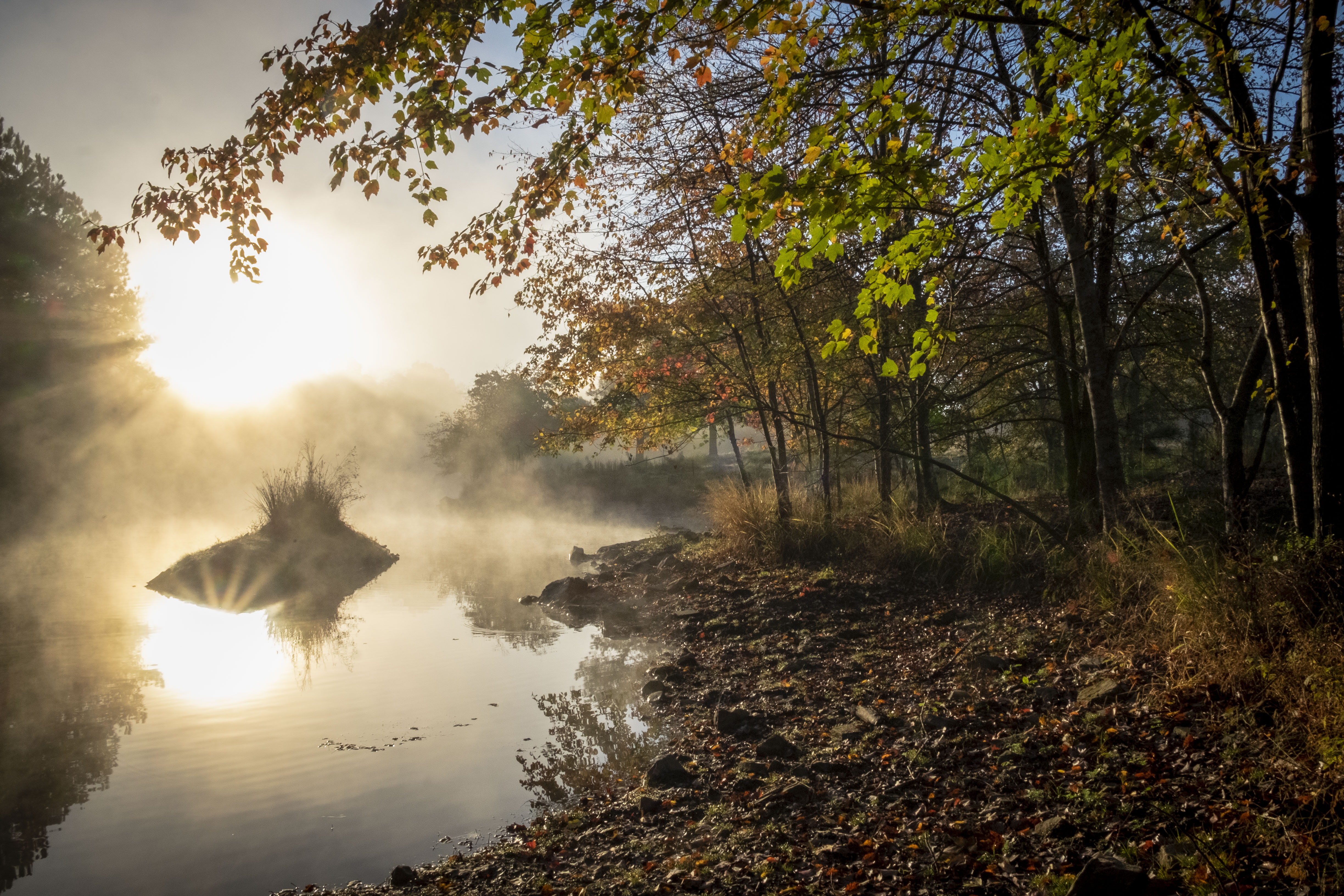
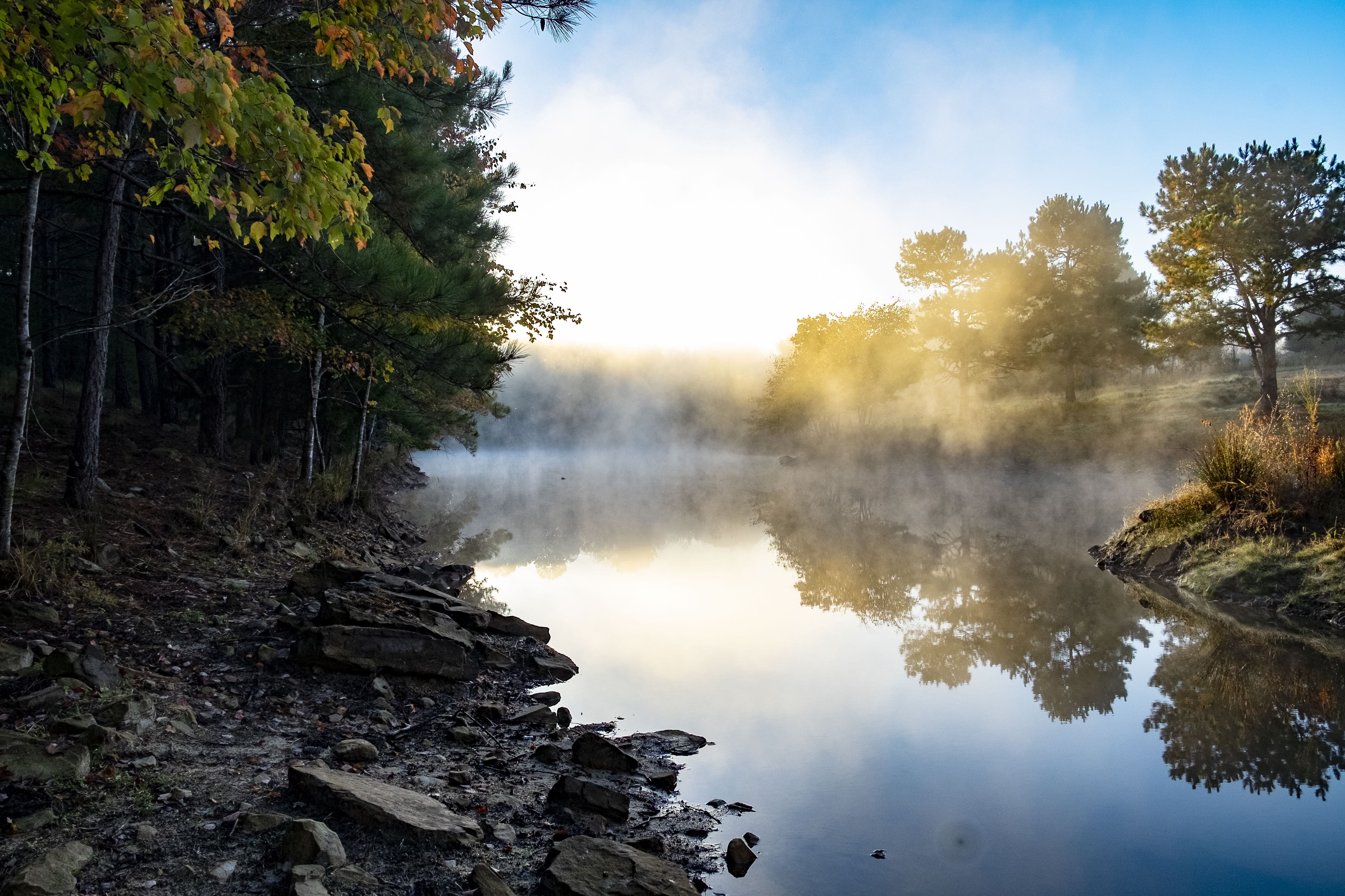
Yesterday morning was absolutely beautiful so I took the opportunity to snap a few photos. I haven’t taken any photos of our pond in the back 40 because after having it enlarged it looked so raw. Mac said there were baby Killdeer on the pond so I went in search of them. I never saw the babies but managed a few of the grownups. Also got a frog but didn’t know it at the time.


Hunter & Tuco wondering what I was looking for.


After a while we went through the woods, squirrel hunting. On the way back 2 geese decided to check out Duck Island.


Cutter loves to swim.


The sun was playing color everywhere. Hope you enjoy these as much as I did taking them.
I’m going to be in the art walk again this year, so save the date! I don’t know where I will be set up, but will let you know closer to the day-of…. Be sure and vote for me in the “People’s Choice” category, I would sure appreciate it 🙂

Here are some of my Final Photos for my Intro to Digital Photography class. We were introduced to the big 3, ISO, Aperture, and Shutter speed. Learning to use white balance and the histogram have made a huge difference in addition to the big 3. Some of these you may have seen before, but worth another look. Since this was my final for the semester I tried to incorporate as many different styles as I could. In other words not all of my animals, but of course couldn’t help but sneak a couple in. I have some more to share I’ll put in another post.
In this portrait photo (requirement of final; one full body and one up close portrait) I had to remove a gate from the photo. Since it’s digital photography and learning Adobe Photoshop was part of the course I thought that was allowed.


Had way to much fun trying to capture motion with this one. Mac drove down the driveway in his ’55 T-Bird he’s resto-moding as I hung out the side trying to catch the wheel.

This one of the leaves in a creek I changed to black and white except the one leaf. I should have cropped some of the photo down to more of just leaf. Again I was trying to show using Photoshop.

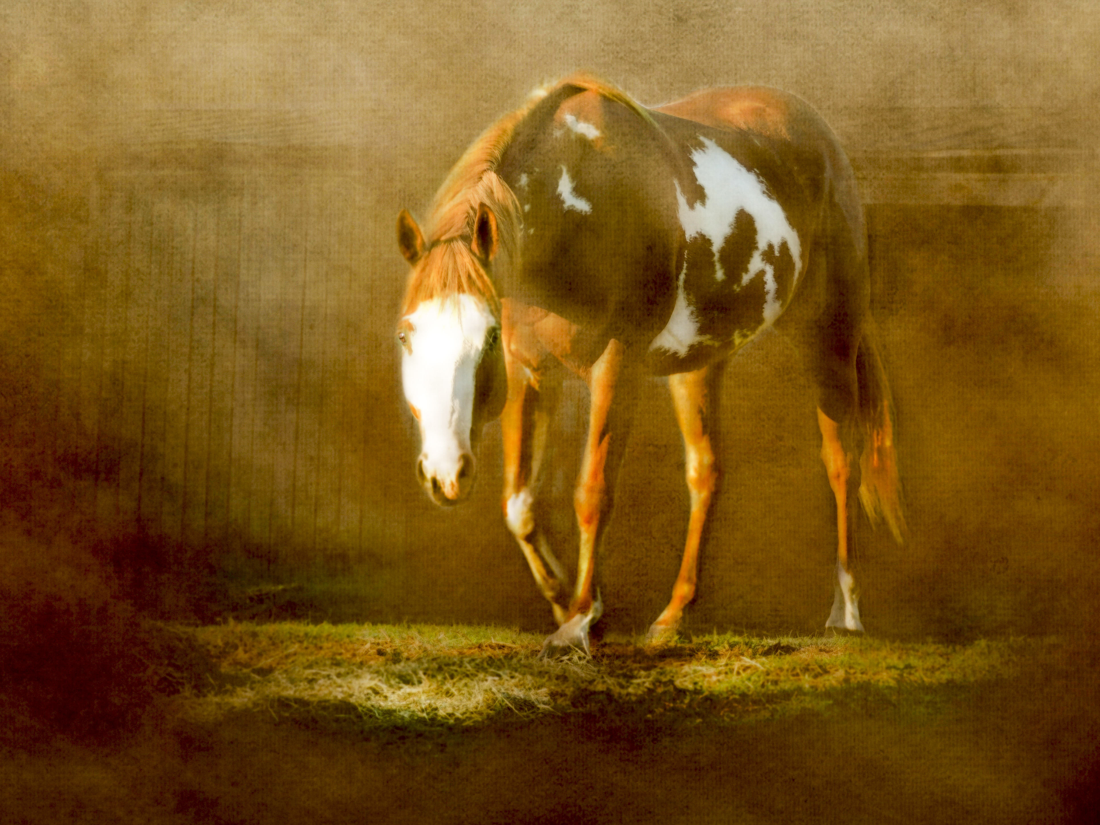
This one I was trying to capture motion. I love this shot of my paint gelding Joker.

I wanted the sunset reflecting off my tank in this shot. You can really see the clouds and blue sky.


Now it’s time for my finial in Advanced Digital Photography. There should be more blending and light painting in those, I’ll share as I progress.
The following are a few photographs that I’ve taken for my Digital Photography class. Learning how to use my camera has been my favorite class so far. My instructor, Dan Dillon is awesome and makes the class interesting and fun. I’m not a professional by any means but am starting to produce some usable photos for my illustrations and graphic designs.
This is a panorama photo, manually blending of five photos. I would love to have this made into a lamp shade.

Requirements for this photo was to blend a human with an inanimate object.

The following are reflection photos.


This is just a practice of doing black & white. I keep trying to capture a photo in a Ansel Adams fashion. Haven’t made it yet.

Hope you enjoy them.
Gp
I’ve been busy in my 3rd semester of Graphic Design and thought I’d share some of my Technical Illustration projects. I believe this is where I’ll be able to apply what I’ve learned as a draftsman/Auto-CAD detailer. The first project is a isometric view of a bracket, which we created from a 3 sided drawing; top, front and right side views.

The turn down radius really threw some of the other students off and if I hadn’t learned drafting I wouldn’t have seen how it should go. I’d had to get so much help from the other students that it was nice to be able to give some help back.
Our next project was to take this isometric and create a Patent drawing. I decided to use my motorcycle as being what this machined bracket was for. Keep in mind this is not really a motorcycle part, just creating a poster. Also, keep in mind I’m not trying to infringe on any copyrights of Harley Davidson, this was just for a school project. I found a free blueprint background download and used a photograph of my 2007 Harley Davidson Street Bob. I then opened in Illustrator CS6 to add my isometric and text. After trying to create the effect I wanted and was unsuccessful I Google on you-tube and found a tutorial on creating this effect. How to create a Blueprint effect in Photoshop CS6 by Altustek was awesome and easy. Thanks Altustek!

Next we had to do a exploded view in oblique, either 45 degree or 30 degree. I enjoyed learning gradients and applying to create the effect I wanted.

The threads on the inside of the nut proved to be harder than the threads of the bolt. I also had trouble with creating a lock washer so, with suggestion from awesome husband, substituted with a flat washer. I still want to learn how to create a lock washer, using Illustrator and not just “eyeballing”.
Next post I’ll share some of my projects from my Digital Photography class (favorite class so far).
This gallery contains 25 photos.
Fun with font could have been the title of this post. My latest creations are two typeface portraits; one of Amy Winehouse and a self portrait. These are for my Typography class and were supposed to be done in Adobe Illustrator, black only, on a 10″ x 7″ art board. We had to pick a famous person and do a self portrait.
To start this project I began by searching for tutorials in YouTube on doing typeface portraits. Only one tutorial showed up in Illustrator, the rest were done in Photoshop. Since I’m learning both programs, and I thought the Photoshop creations had the effects I wanted, that’s what I went with for Amy Winehouse’s portrait. I used two fonts; Cooper Std Black for the shadows and Corbel Regular for the mid-tones. Learning the clipping paths took a few try’s, but finally managed it. I used the lyrics to her song Rehab, from the album Back to Black. I think it came out nice, just not in Illustrator.

For my self portrait, which I knew had to be done in Illustrator, I tried using the same principles that I used in Photoshop. Frist I picked out three fonts; Cooper Std Black for shadows, Constantia Regular for mid-tones, and Corbel Regular for highlights. Created an layer with a rectangle filled with each font of the correct size, 7″ x 10′. I did adjust a few effects for each font, kerning and tracking, to get the right shade. Then so I could edit, I changed the font to outlines. Using the lasso tool I began deleting what I didn’t want and leaving what I did. This sounds easy but you have to think backwards. Instead of selecting the dark areas for the shadows layer, you have to pick everything else. I’m learning how to use negative space and I think this was a good exercise for that.

I used Amy Winehouse’s song lyrics for the words because I already had them ready to use. I think the Photoshop effects look more professional, but hopefully the Illustrator portrait will get a passing grade. I really don’t want to do it over.
